At TruckX Inc, I was responsible for designing a Web/mobile dashboard interface for trucking company dispatchers to track and manage loads.
TruckX Inc is a trucking technology company that provides Electronic Logging Device (ELD) and Dispatch management solutions for small and medium businesses.
This product is still in the development phase so please reach out to me for the final designs.
2018
Product Strategy, User Experience Design, Visual Design
Pen, paper, Figma
Paper sketches, Wireframes, High-fidelity mockups
Trucking companies receive load orders from various distributors. Each of these orders have a ton of load information in formats that are not standard across the board. Additionally, dispatchers have no convenient way of tracking these loads once they have been dispatched to truck drivers.
The task at hand was to design an intuitive and all-encompassing dashboard (for Web and mobile) that provides a standard and convenient way of tracking and efficiently managing these loads.
Working with the executive stakeholders, I defined some user experience goals to drive the design of this tool.
Simplify the process of load tracking and management
Most relevant load information like delivery status should always be visible
Show as many load entries as possible for better management

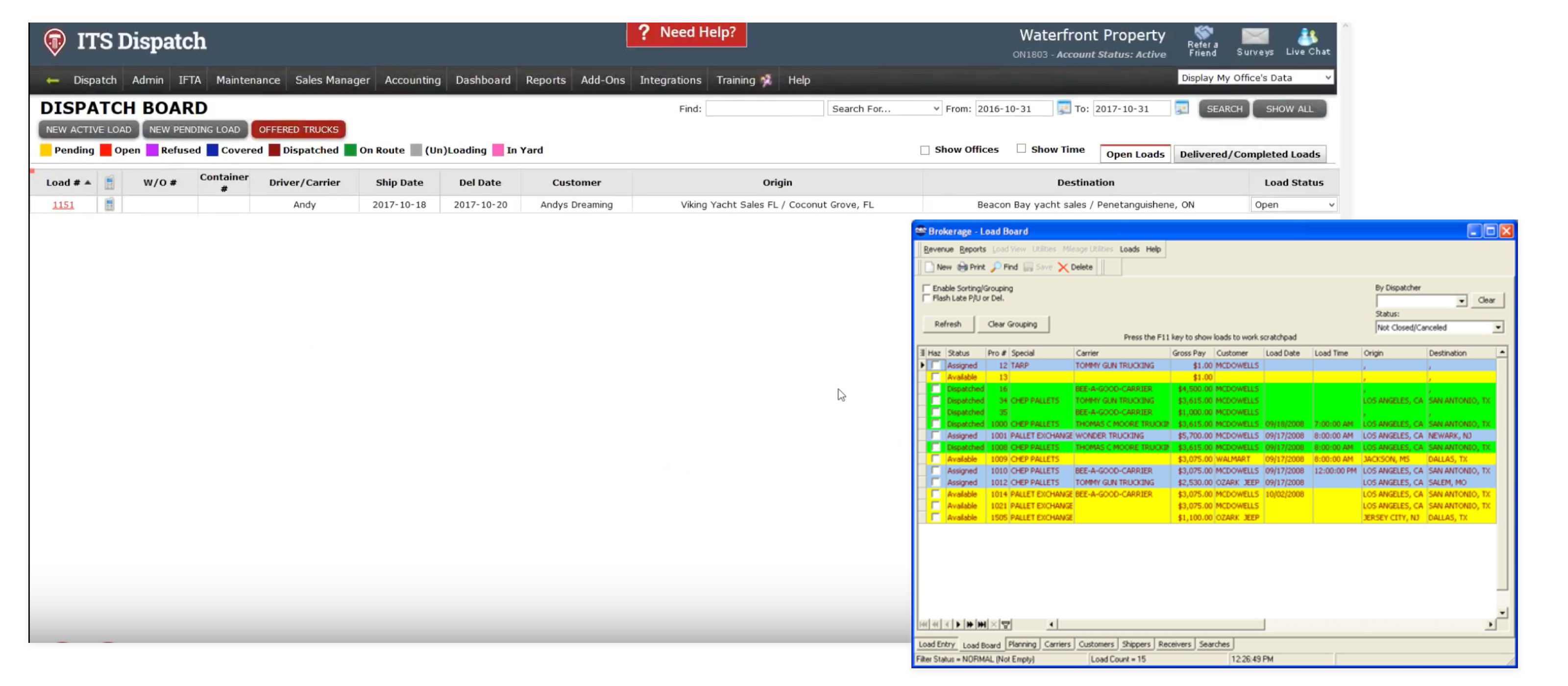
I conducted a cursory study on some of the existing tools used by dispatchers for load management. It appeared like there was no need to reinvent the wheel since they had tackled a huge part of the problem already. However, I noticed the interfaces could use better information architecture and structuring of data.
Display of an overwhelming amount of information
Dated interfaces with jarring colours
Poorly structured information architecture
I want to view all loads.
I want to view status of all loads.
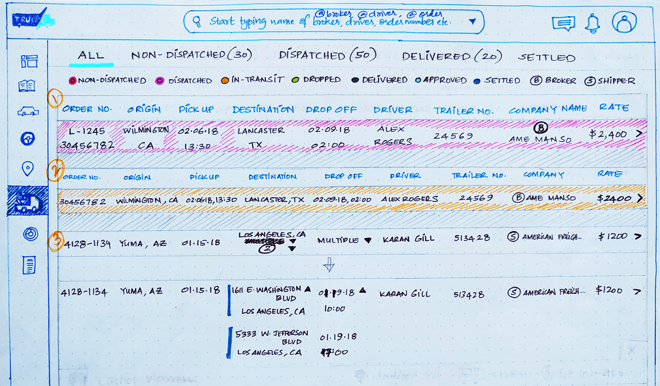
I want to view load information like order number, pick-up/drop-off locations and times, total distance, driver name, trailer number, current location, company, and rate.
I want to view multiple pickup or dropoff stops.
As seen below, I came up with some user flows based on the requirements of the user and the fundamental needs of a load dispatch system.

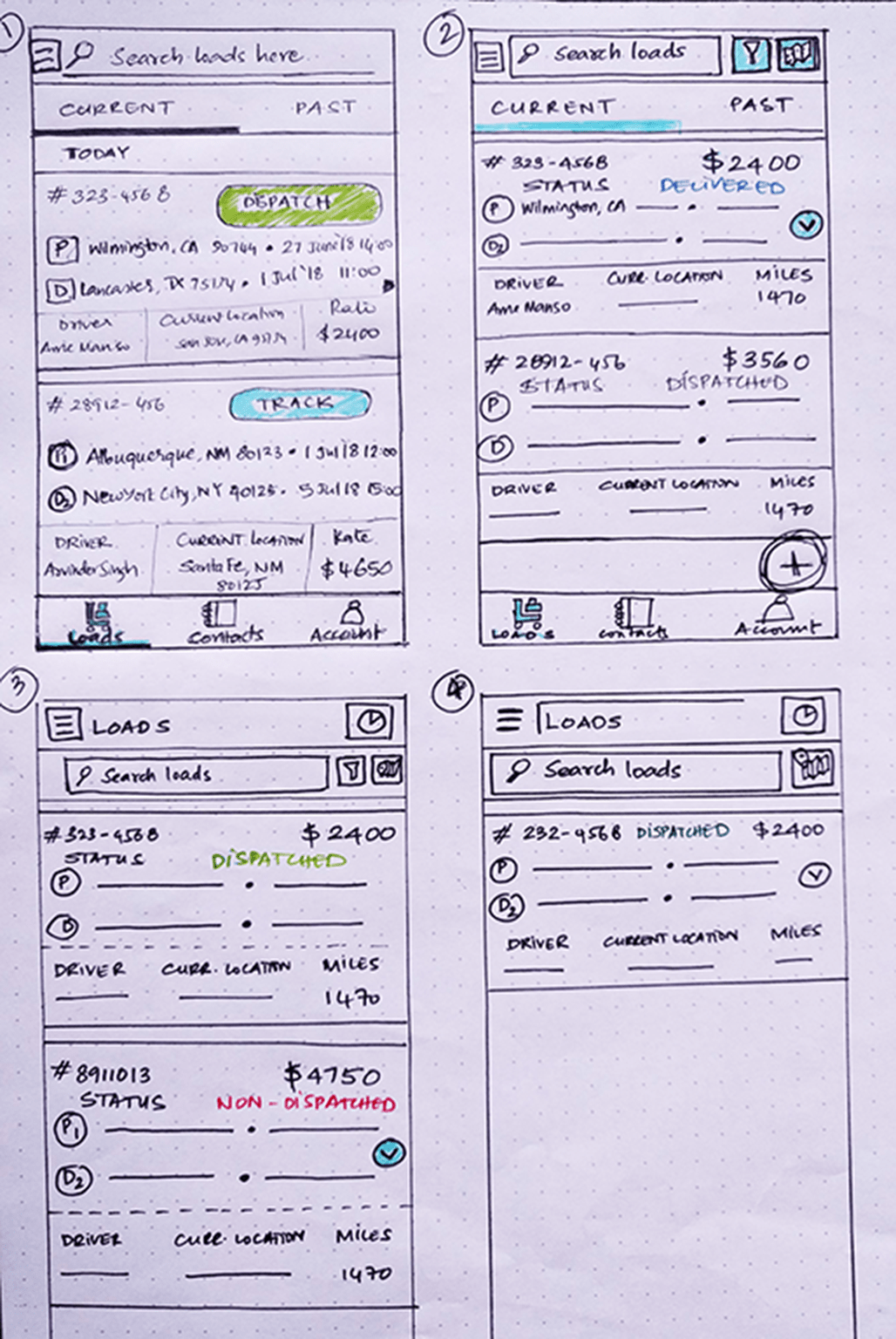
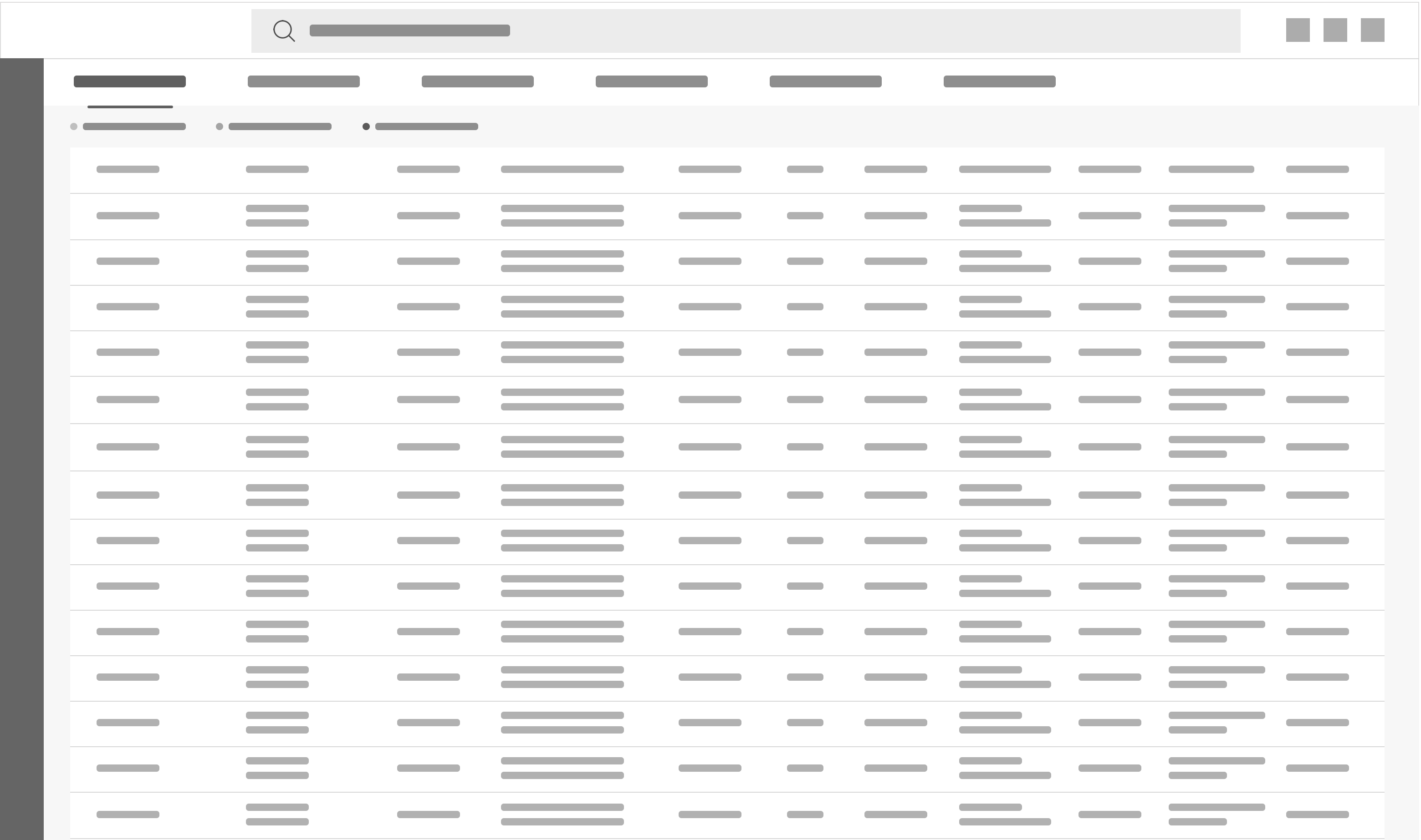
With the flows and stories laid out after discussions with the stakeholders, I came up with different concepts to best represent the data in the form of a dashboard. This was done for both Web and mobile platforms.


An interesting challege here was to design a way to represent all the extensive load information on mobile. The most viable solution was a card design as this gives the flexibility to have a responsive way to include details of each load. The load data that is displayed horizontally in the dashboard design for Web was stacked one below the other within a card for mobile.

If you'd like to see detailed visual designs, please reach out as this product is still under development.
One of the complexities of this project was to gracefully design the dashboard for the mobile platform. The density of information is quite high and it was imperative to show all of it in an intuitive way that doesn't overwhelm the user. It was also interesting to design a way to track the progress of each load delivery considering how detailed each of them could be.
Once the product has been implemented and brought to fruition, I plan to work with the stakeholders to conduct some usability studies on customers; this would help further understand their pain points with using such a system and synthesise the data into creating a solution that is more tailored to the user.