
A service to help a computer-illiterate person find and apply for jobs with the help of a kiosk and voice assistant. Job openings are curated based on the user's profile information. Users can apply for them with a single touch. They can also track the status of all their applications.
View prototype7 weeks
Market Research, Product Design, Voice UX Design, Branding, Visual Design
Paper, pen, Adobe Illustrator, Sketch, Figma, UsabilityHub
User journey map, User stories, Voice Persona, Dialog flows, Fallbacks, Paper sketches, Sitemap, Lo-fi Wireframes, Interaction Flow Diagram, Style Guide, Hi-fi mockups, Prototype
I came across this article a while ago and was immensely moved by it. It sheds light on the story of how a man helped a homeless person apply for jobs. Applying for jobs these days is a difficult task for people with limited access to resources. Most companies, organisations, and stores require online job applications. Ironically, how do we use technology to solve this problem?
A voice assistant that helps the user create a job profile and find suitable jobs. The experience is augmented with an easy-to-use and intuitive kiosk interface.
In order to understand the prevalence of digital divide, I read this article published by the Nielsen Norman Group which discusses a study done between 2011 - 2015 to test the computer skills of ~216,000 people across 33 countries. It was found that 26% of adults were unable to even use a computer. How much more of a struggle must it be for the less fortunate?
Are there any existing solutions in the market?
Screen readers
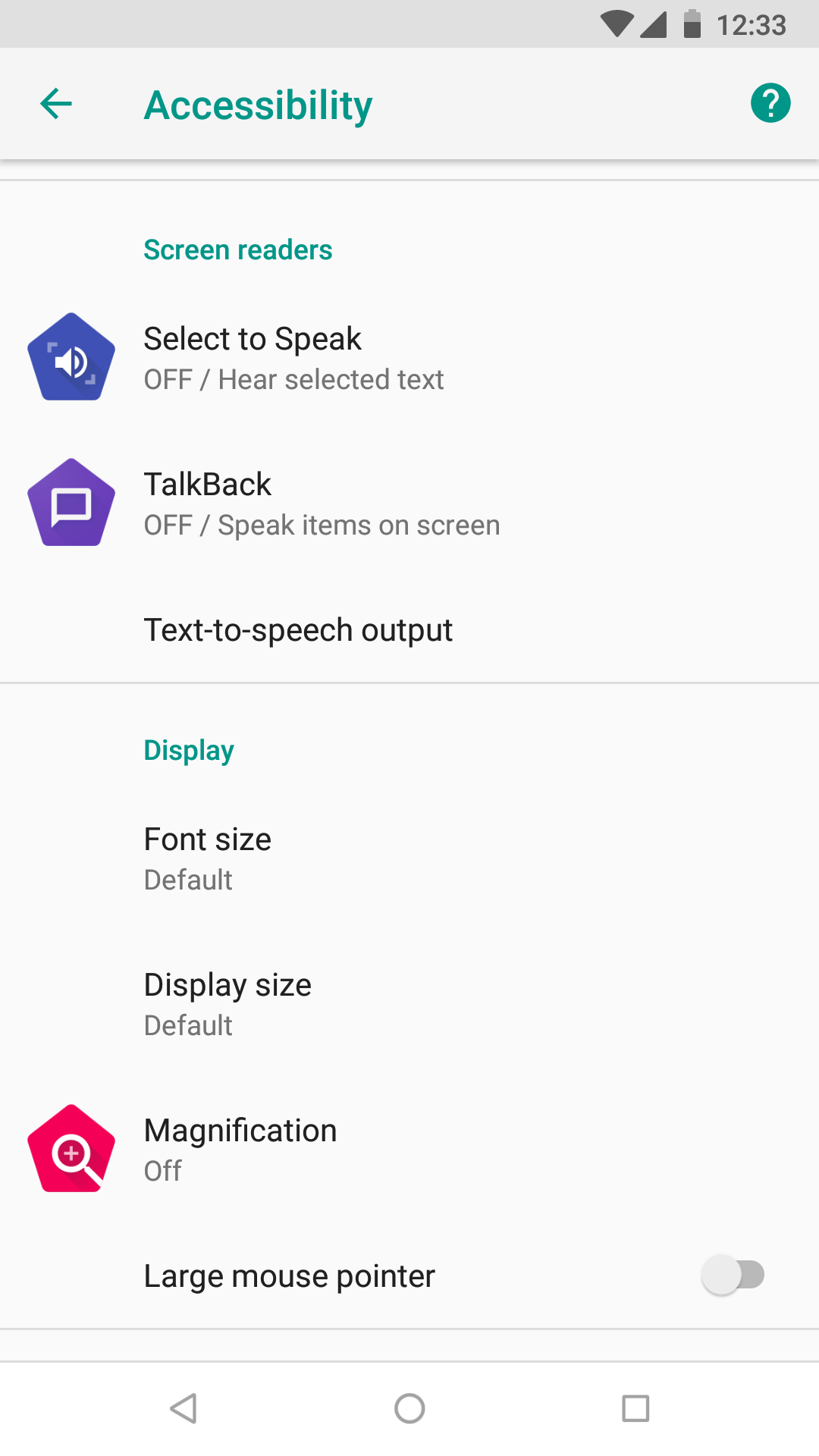
Android Select to Speak
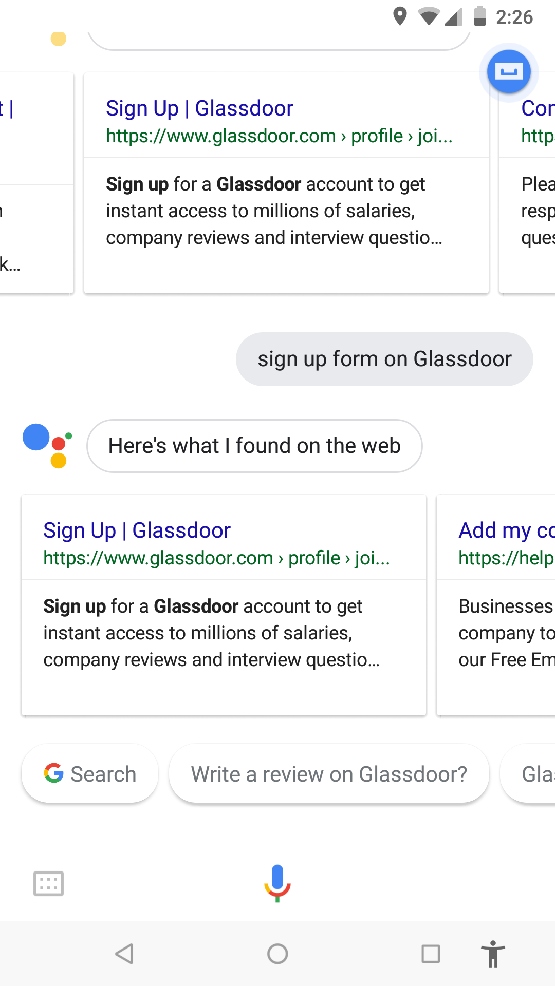
Voice Assistants
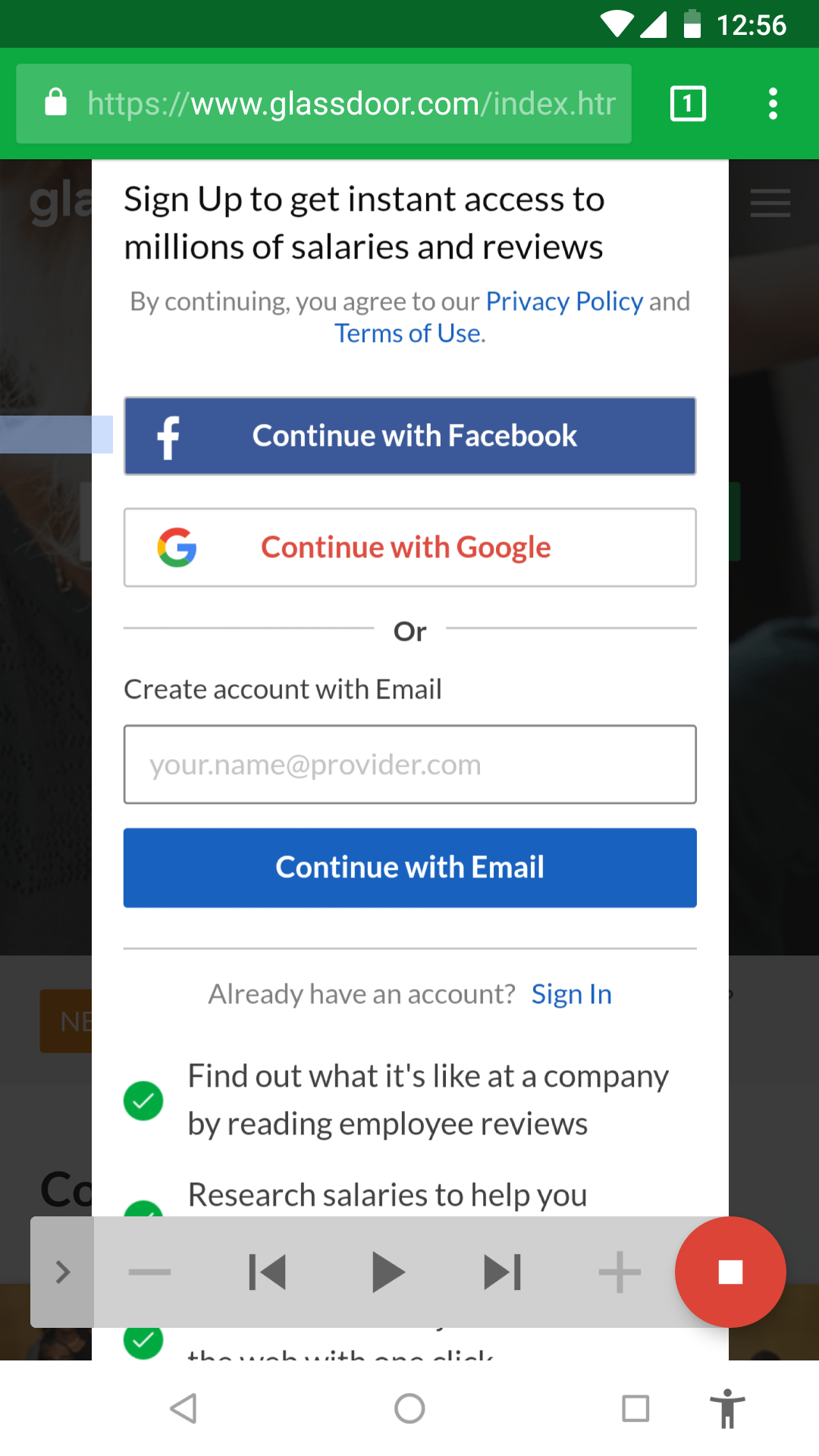
Some retail stores let people apply for jobs via their in-store kiosks. Managers can quickly screen a large number of applications. Even though this process is a seemingly quick one, going to every single store to apply for jobs would be exhausting. Ideally, we want a single place for their job seeking needs!
The underlying issue with all these solutions is that there is no easy and consistent method to communicate with the Web using voice for a technologically-challenged person.
There's a fairly large section of the population that is technologically-challenged.
Homeless people are limited by accessibility to resources even if they're tech-savvy.
Ease the job application process for the technologically-challenged using voice interaction.
Increase accessibility to the application process.
Make it convenient to track job applications and follow up with employers.
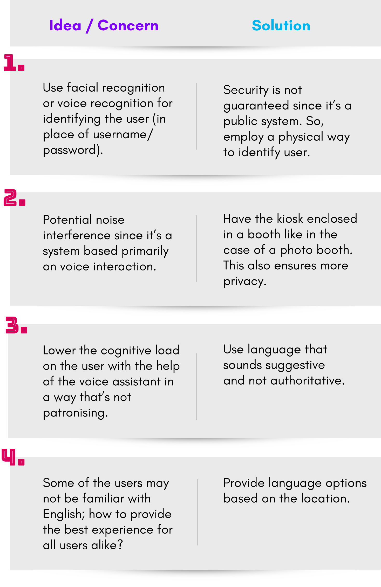
Donning the hat of a product manager, a few solutions came to my mind in order to solve this problem:
A browser-level feature using voice to talk directly to users.
A system-level feature integrated into operating systems which allows screen readers to read out exactly what users want to hear and receive user input.
A stand-alone voice application that can be installed on mobile and desktop devices.
These solutions would have to be highly context-aware to work well. While they are programmatically easier to implement, there's still the issue of accessibility to the Web. I needed a more holistic solution!
A stand-alone kiosk, installed in multiple locations which would let users interact via voice and touch to create a profile, apply for jobs and keep track of them. It would be easily accessible to everyone and users don't have to own a device at all!
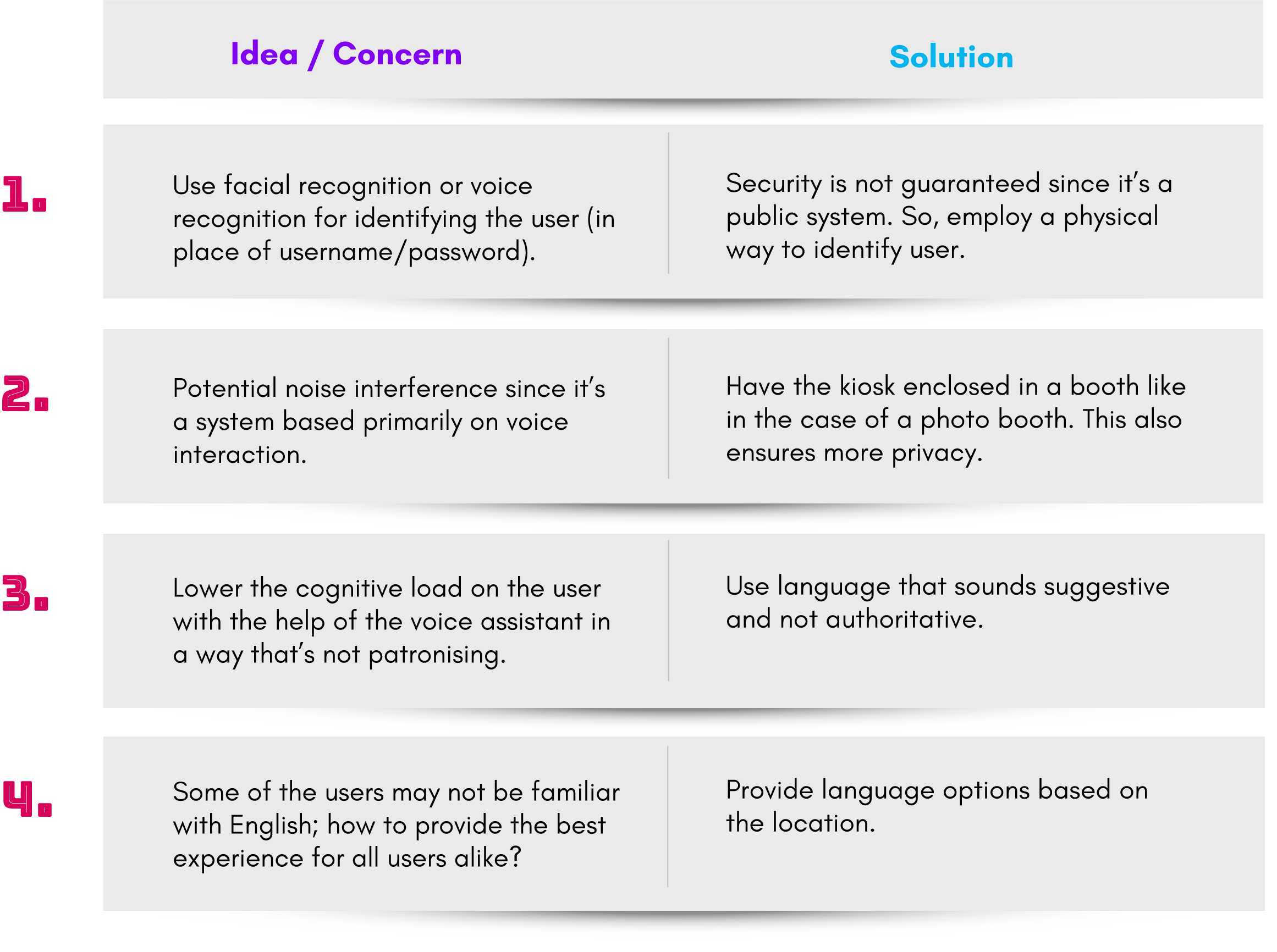
Some pros and cons associated with implementing this idea:
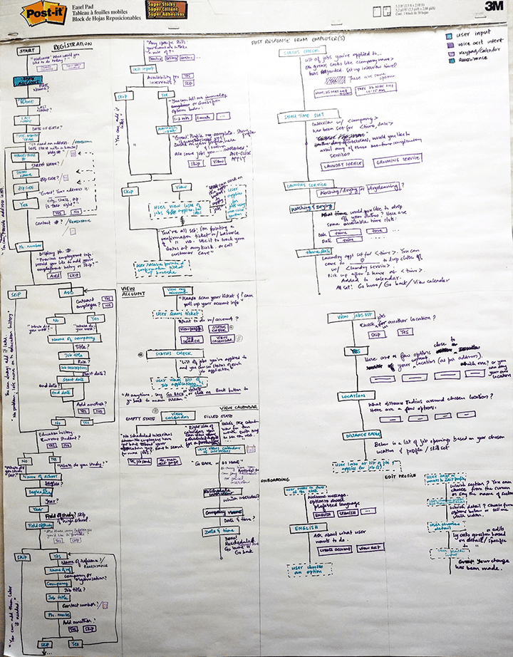
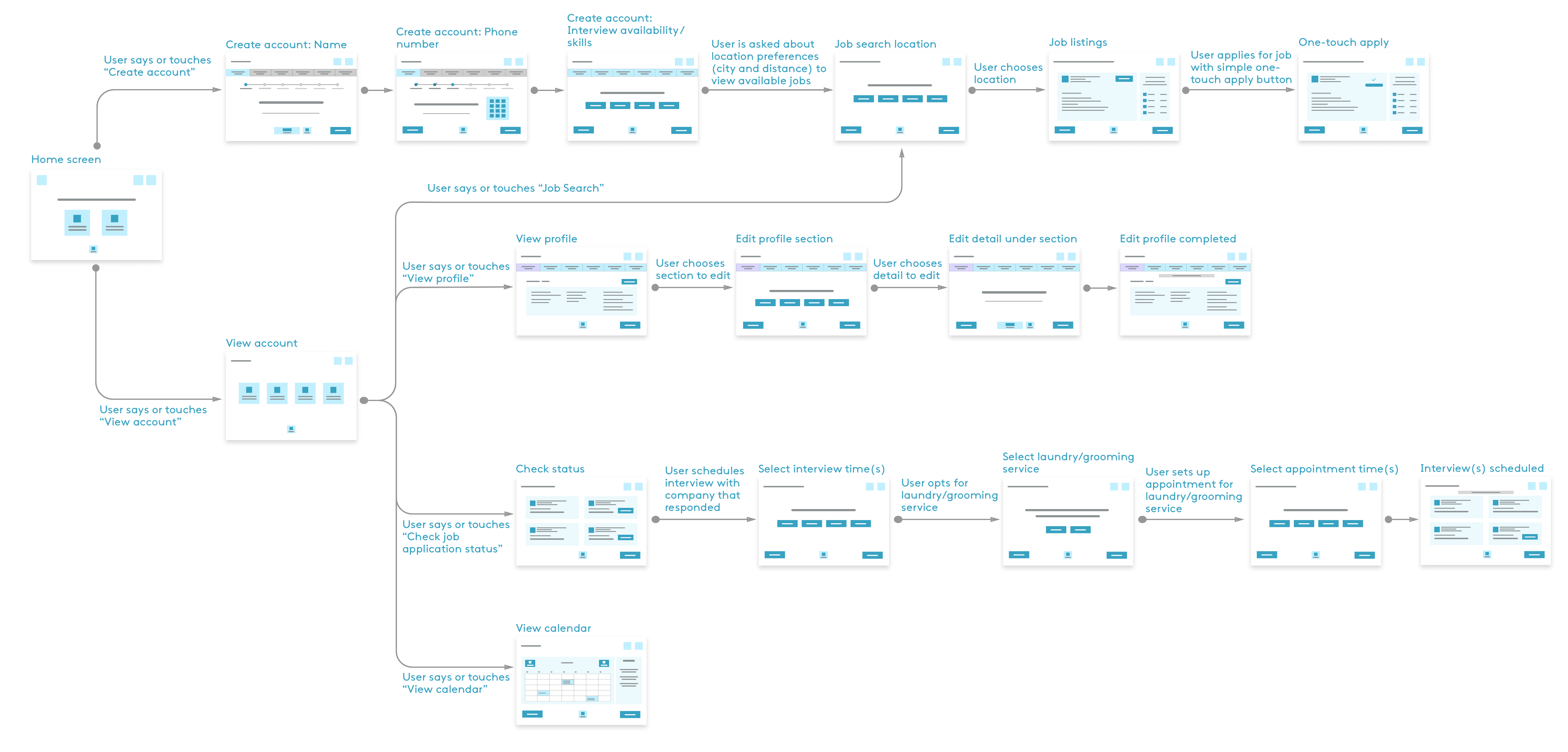
In order to empathise with the user and plan the product interaction, I worked on a user journey map. It helped me clearly define the product as a self-containing and wholesome system.
 View user journey map
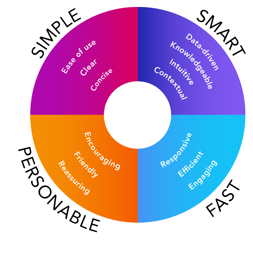
Conversation needs to be based on how people speak and not how they write.
Errors should be opportunities to use fallbacks to progressively guide the user.
Conversation should always end with a question or a confirmation for completion.
Use context and vocabulary that helps connect with the user.
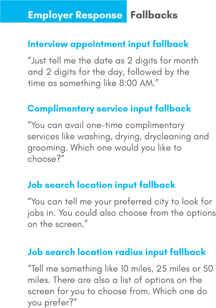
If the bot is unable to understand a user input, error strategies or fallbacks had to be defined. This would help with task completion. There would be three kinds of fallbacks: global, context-specific and help.
I sketched out a few design ideas for the kiosk interface, a means of auxiliary support to the primarily voice-driven product. I was inspired by the idea of children's board books, i.e., to really break down and simplify the content while not sounding patronising to the users.
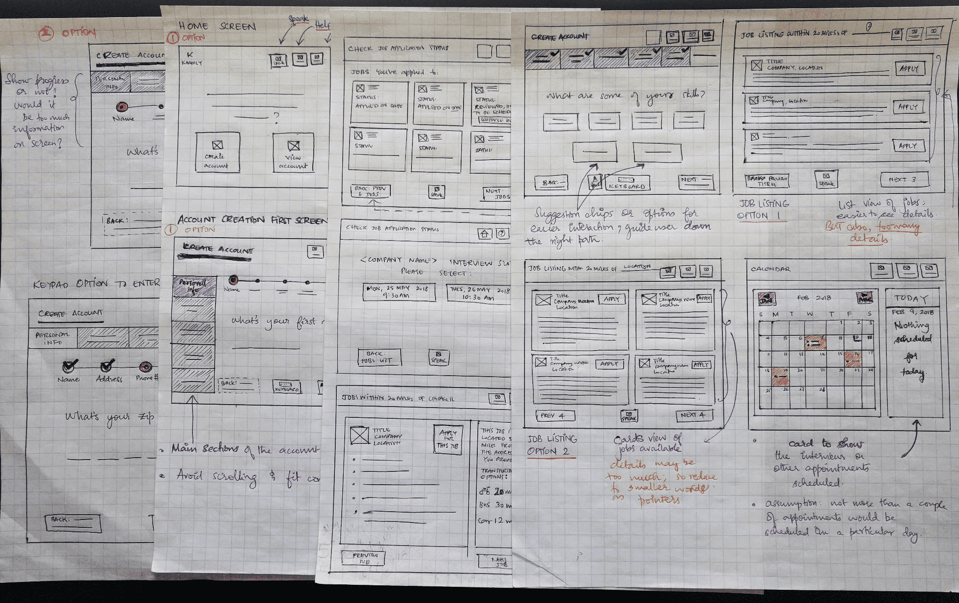
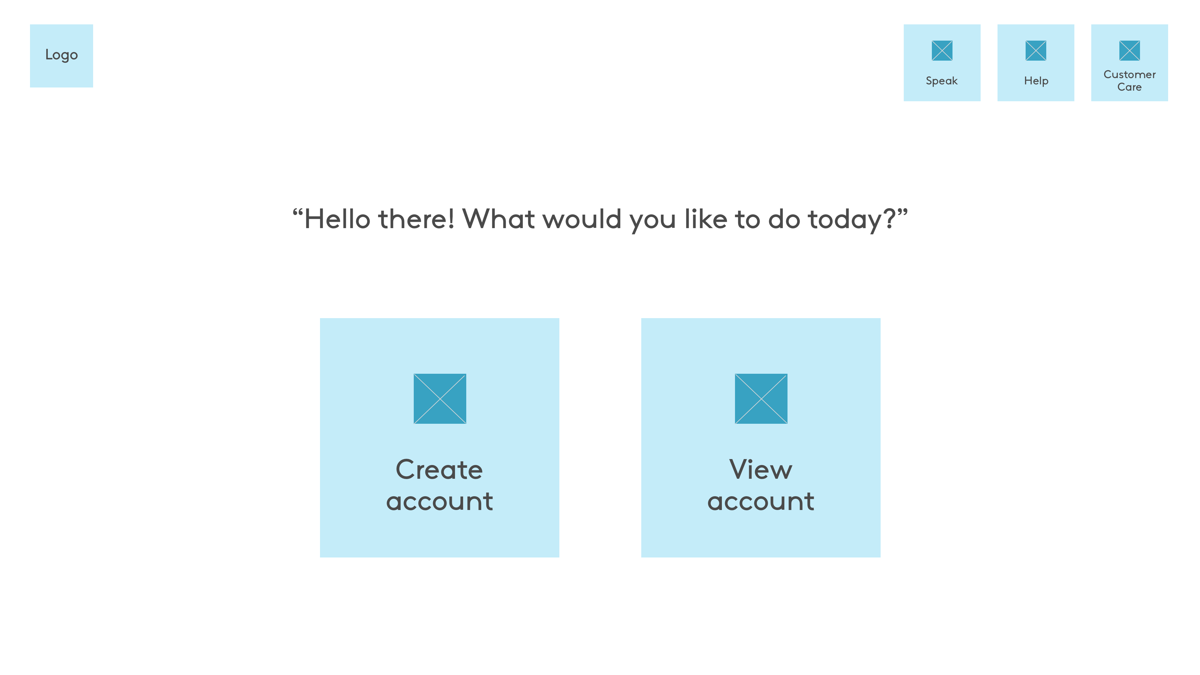
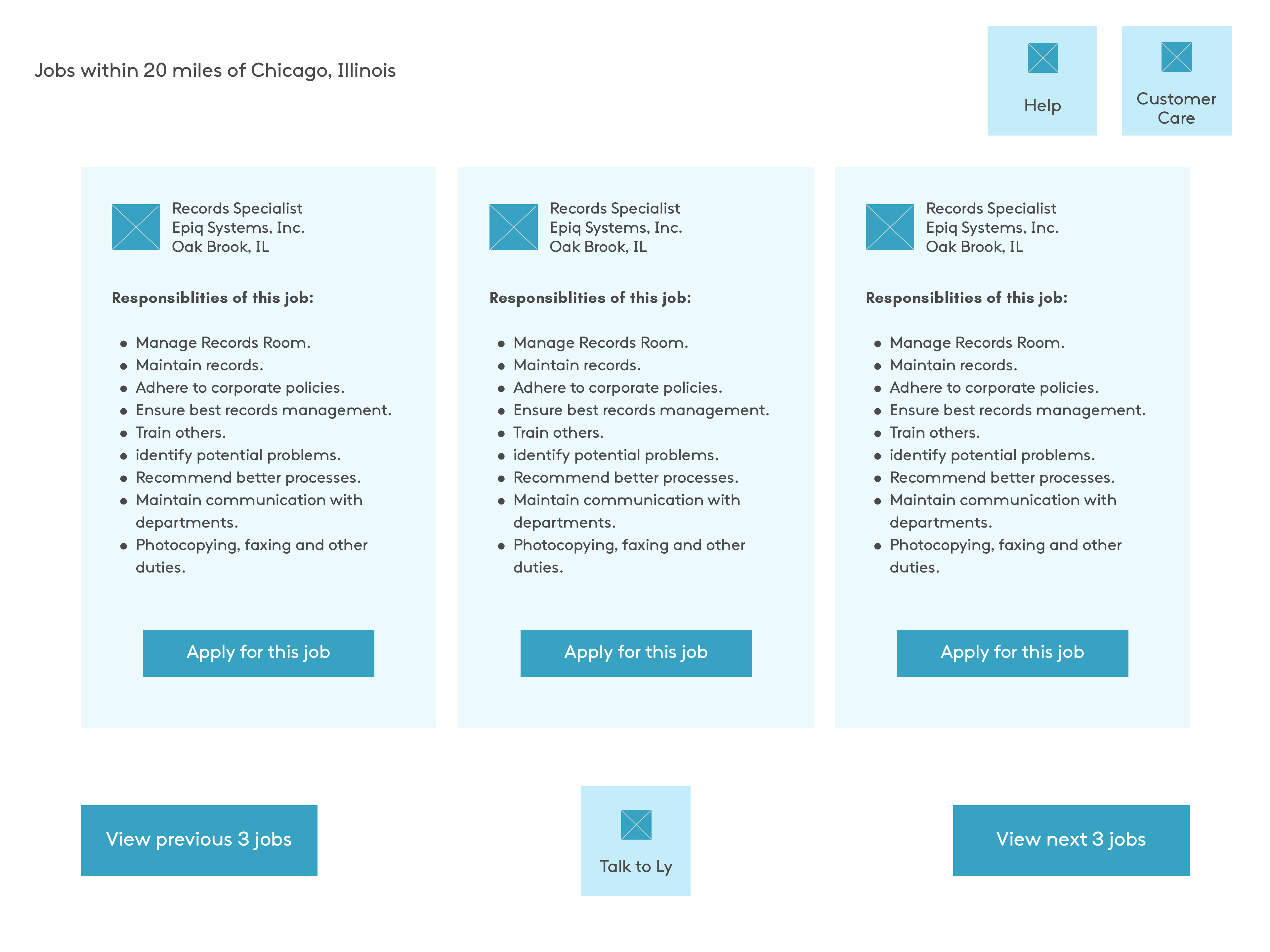
Option A
Option B
Preferred by 88% of the users as they felt that the button was more accessible and visible when it's in the centre of the screen.
Option A
33% users' thoughts:
simpler to understand, less is more, less to focus especially for this target audience.
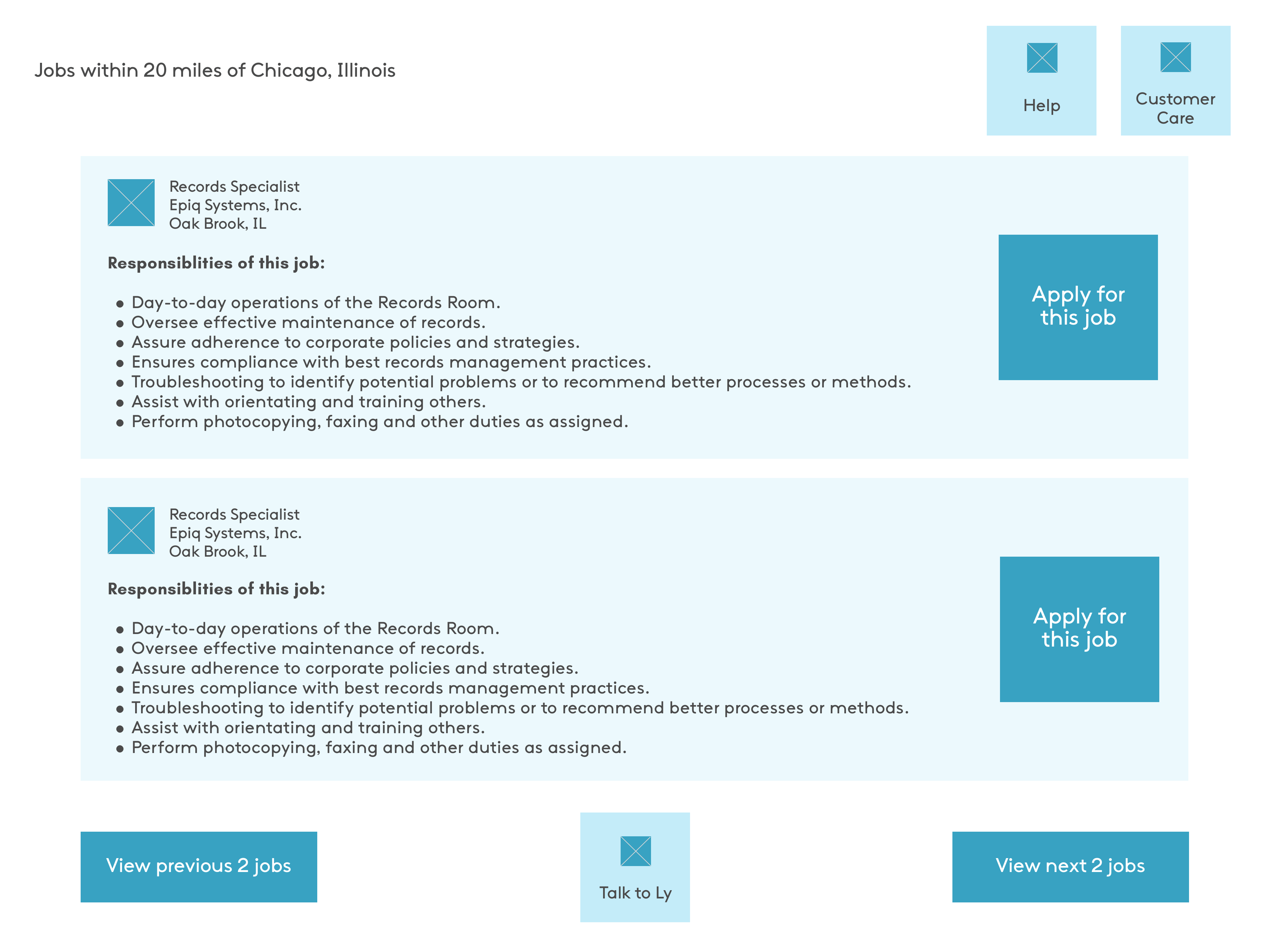
Option B
48% users' thoughts:
easier to see multiple jobs, resembles a bulletin board, comparable listing, concise, faster access even if there's more information load.
Option C
19% users' thoughts:
more reliable, everything is visible clearly.
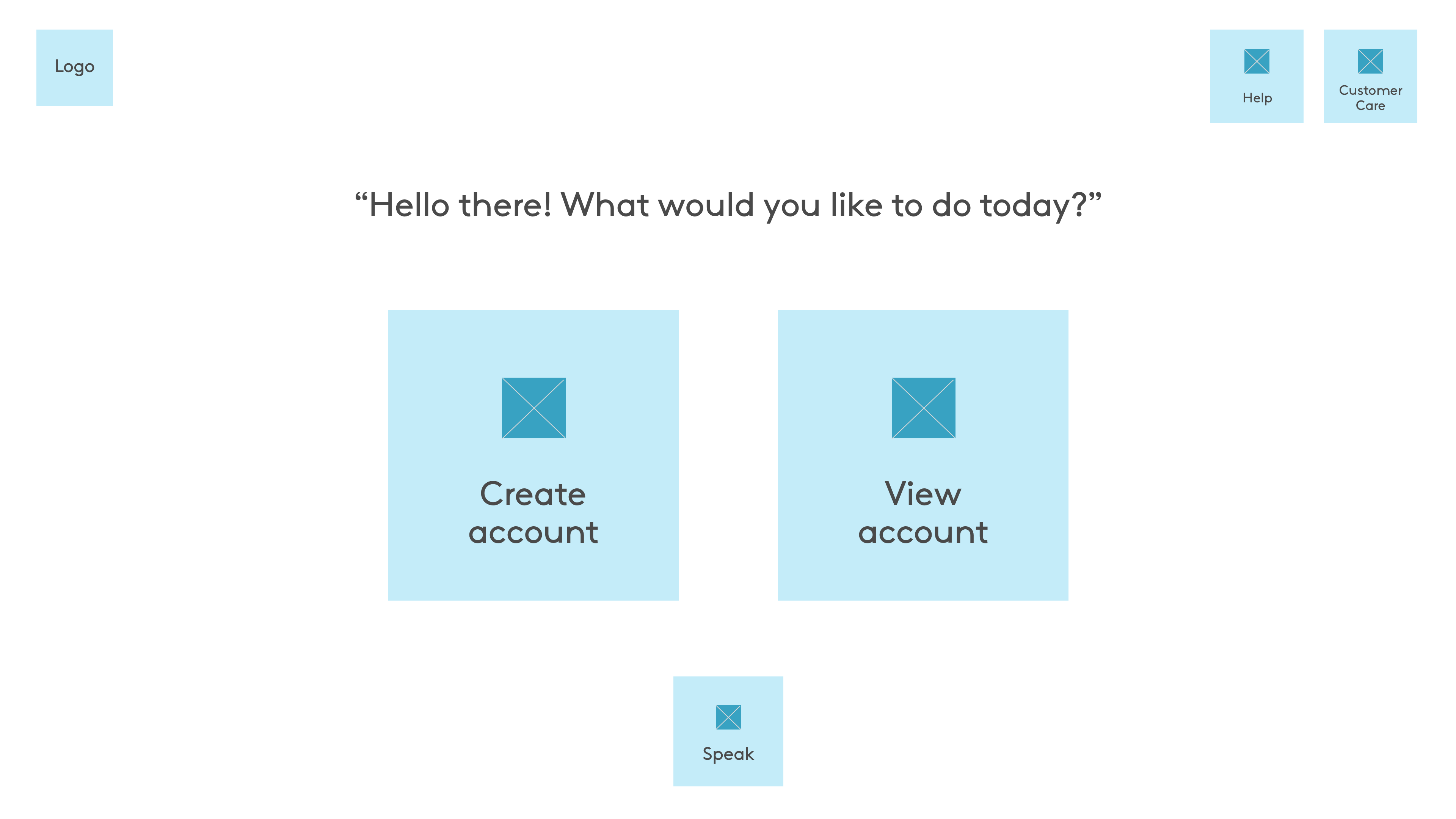
Even though Option B fared the best and since these preference tests can't include voice interaction, I chose to go with Option A. Displaying just one job listing per page will allow the user to apply for it by saying "Apply for job". Multiple job listings on the screen wouldn't allow this.
Out of the 26 users that tested, 65% of them preferred Option B. Some of the reasons provided: "Visually more understandable", "Even if they are computer-illiterate, they would have seen a keyboard".
"Kaam", written as काम , means work in the Hindi language. So I decided to name the product "Kaamly" which also sounds like calmly to give a sense of reassurance.
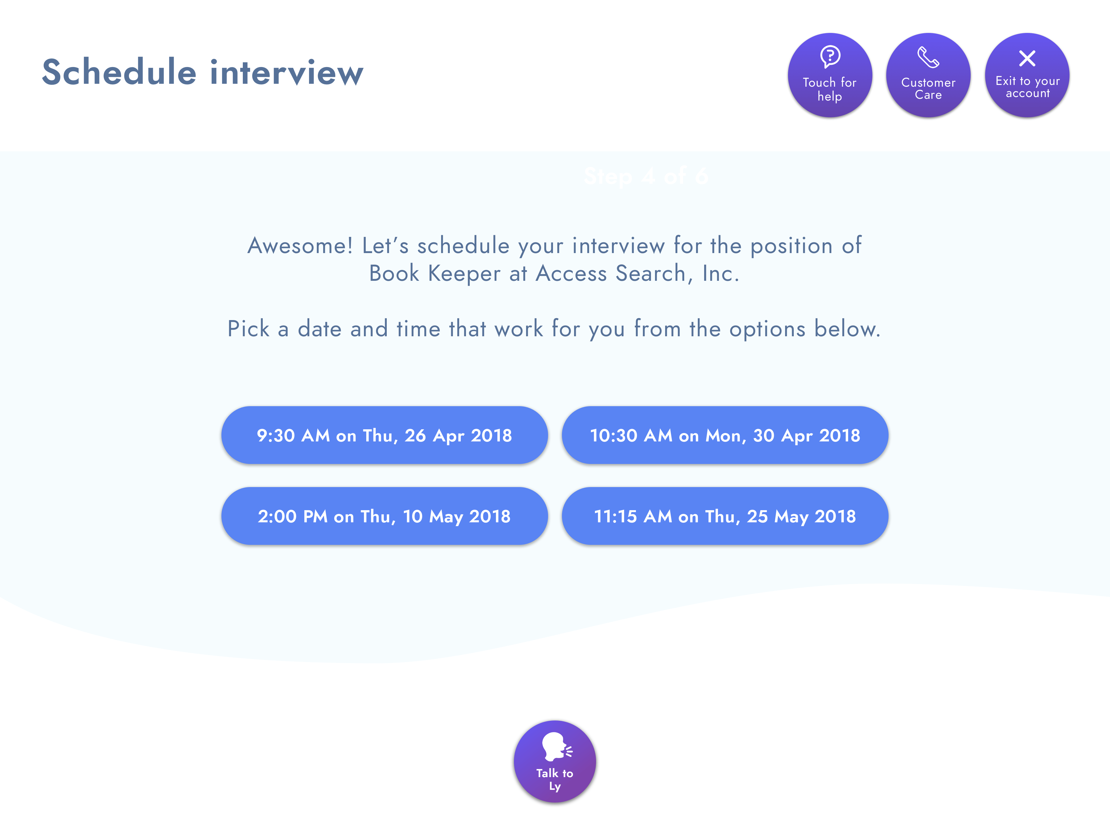
How would more than, say, 6 interview slots (across multiple days) be displayed on the screen? How to ensure users get a quick view of their existing appointments?
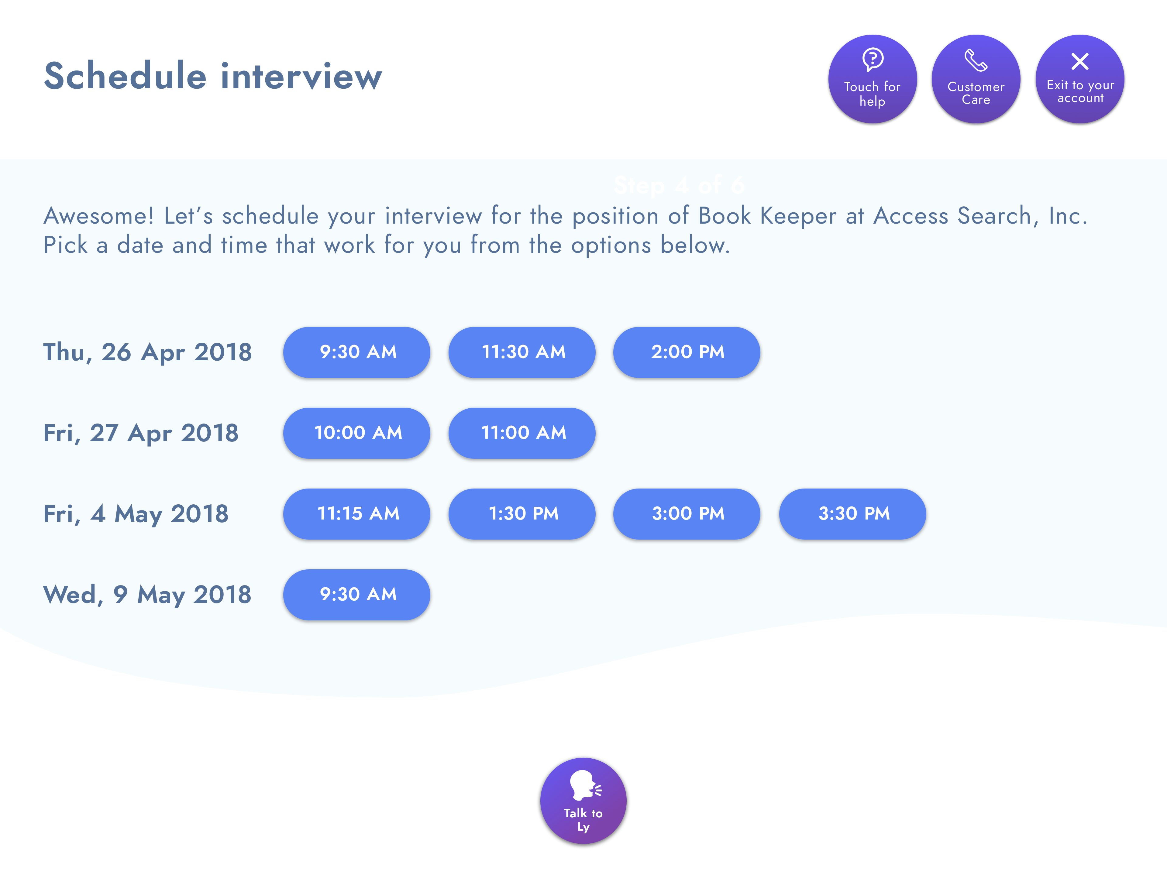
In this iteration, it was possible to show more interview slots but this still wouldn't help the user figure out potential conflicts with any existing appointments.
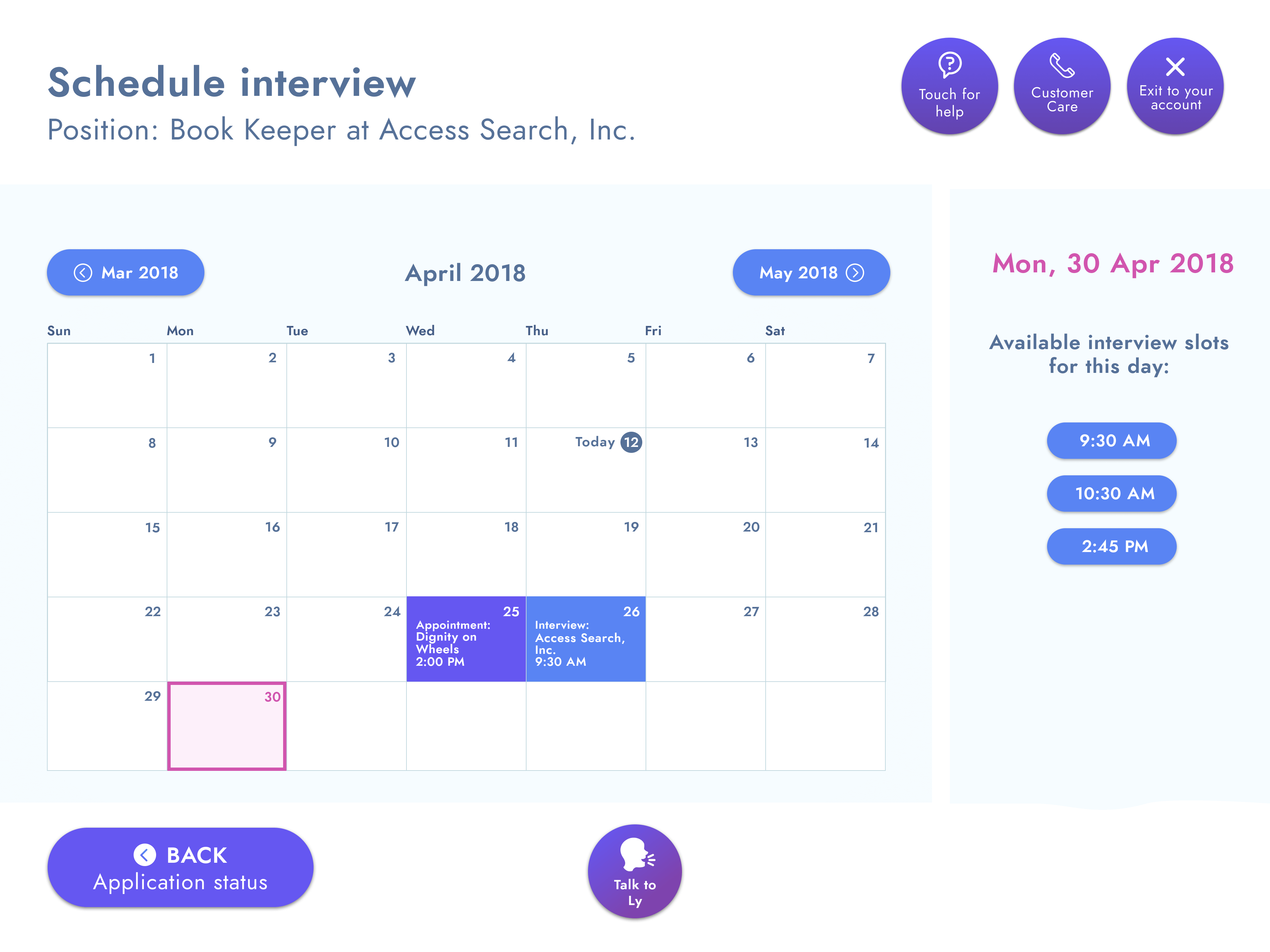
Eureka! A solution that avoids scrolling or clicking through many "pages" of available appointment times by showing user's calendar with existing appointments. This also helps avoid conflicts. Assumption: Not more than 6 appointments would be available per day.
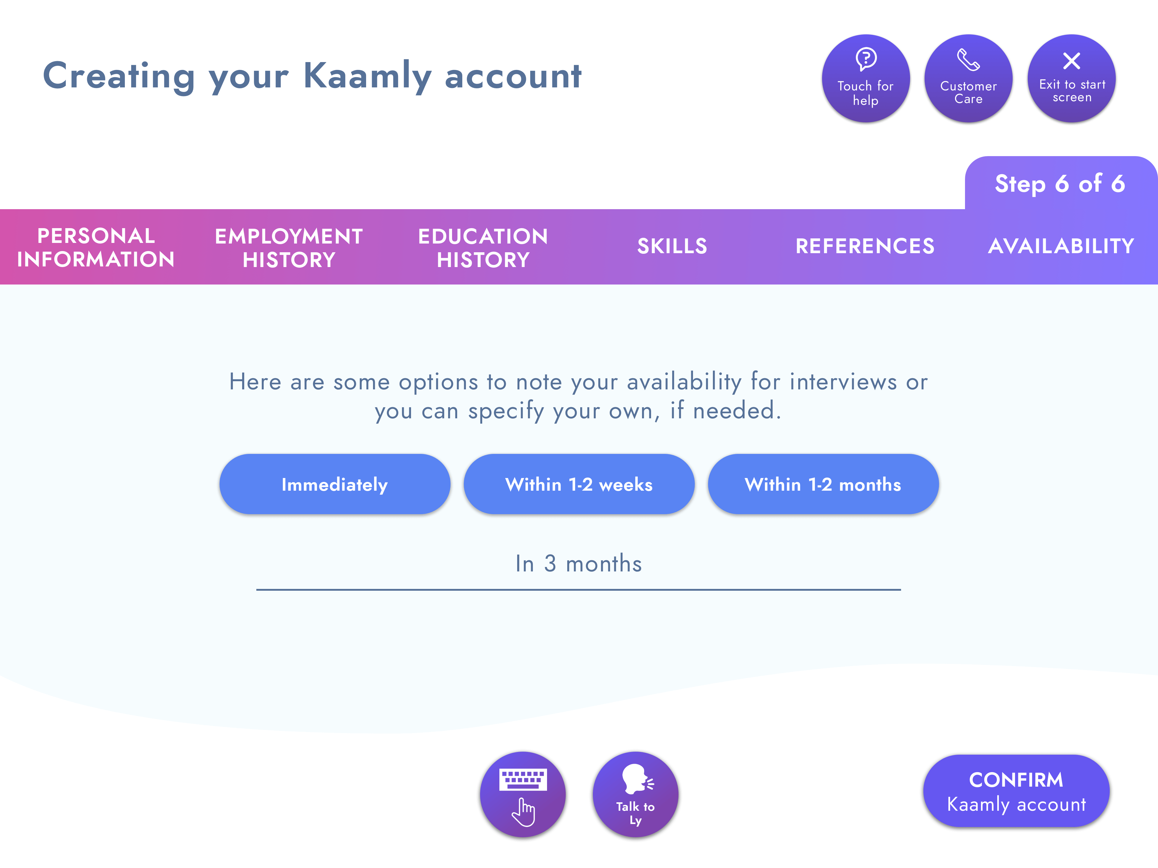
Taking the user through all the 6 steps of the account creation could potentially get tiresome. How to make the job search more instantaneous?
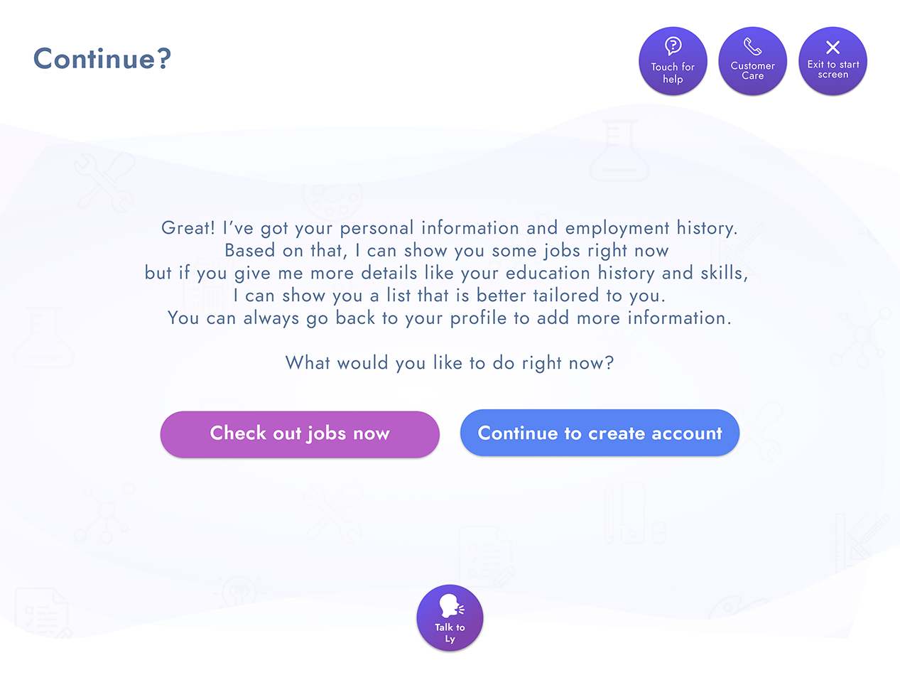
Give user an intermittent and preliminary option to perform a profile-aware job search before going through with the entire account creation process.
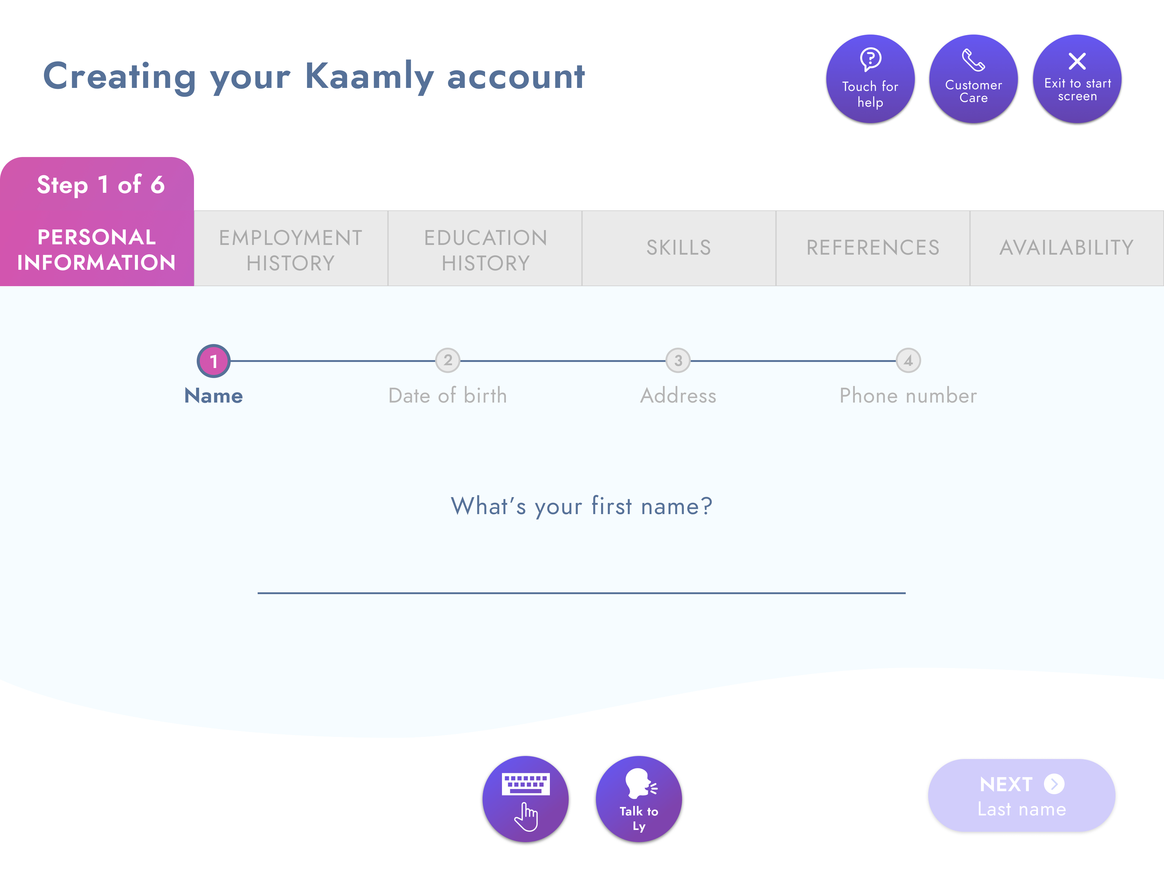
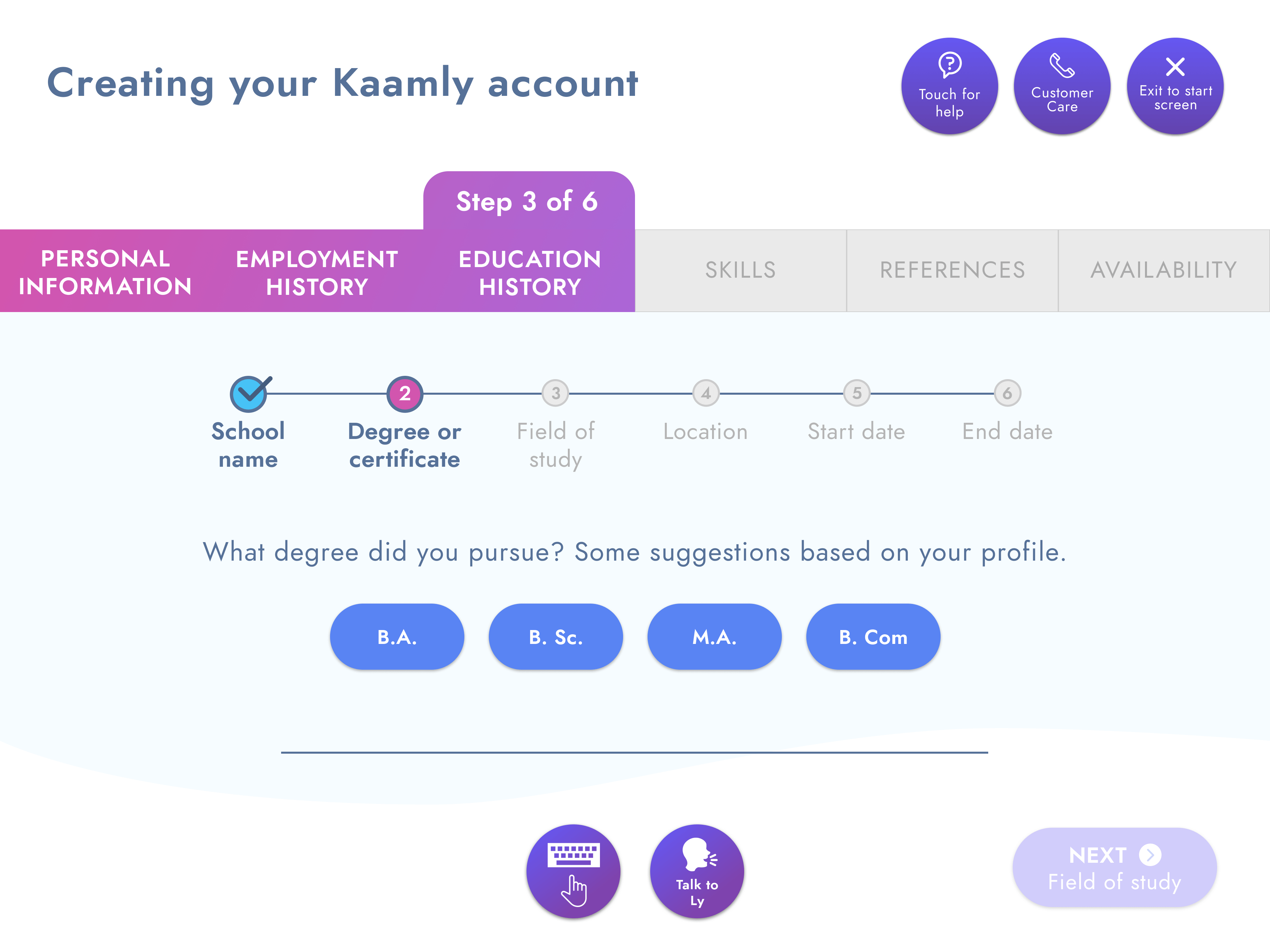
Since these users are computer-illiterate, aggressively simplify the task of getting users' information; each input step would be a screen of its own.

I wanted to design a more accessible keyboard. By choosing Android as the underlying OS, a customisable Android keyboard can be implemented by defining an XML file with the keys and their corresponding input values.
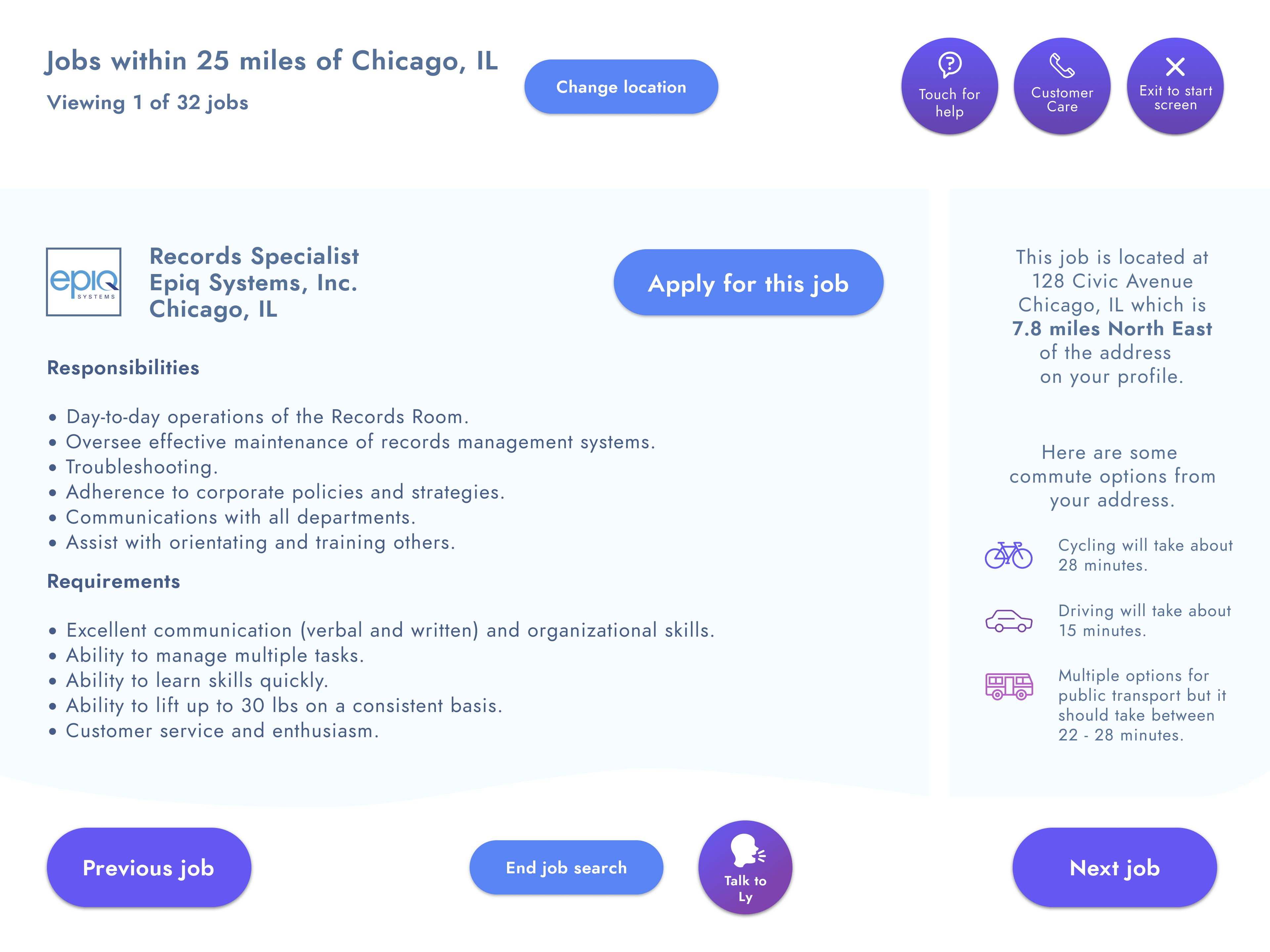
What with having seamlessly collected all the required user information already, the step of applying for a job is as simple and quick as the touch of a button.
Present users with suggestion chips to provide a guided and seamless interactive experience.
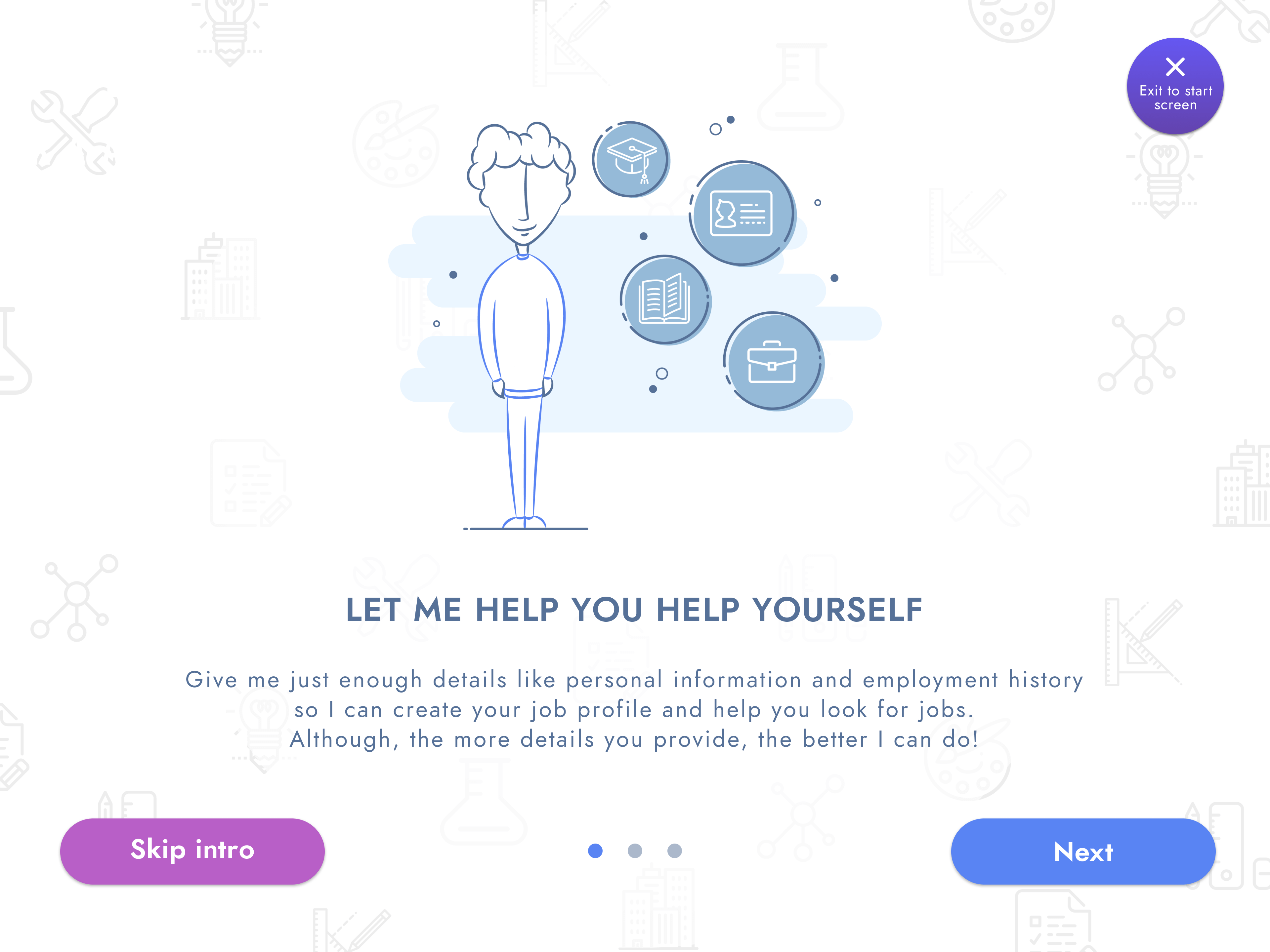
Included a reassuring onboarding guide with quirky illustrations to ensure users know what the process would be like.
Once all the design decisions were made and all screens had come to life, I linked all of them together and created a Figma prototype that would eventually be used for user testing.
View clickable prototypeOne of the hardest aspects of this project is to test it with the target audience. How do I find technologically-challenged users? One way is to go to a public location like a library, survey some users to understand their comfort level with technology and select a couple of them on whom to conduct the usability tests. This is going to be my next step as it would give me an initial idea of features that just may not work as I'd hoped they would and iterate further based on those results.
This has been a true passion project which made me step outside my comfort zone. I had to strip away my knowledge of how the Web works currently, simplify the steps to record information as little chunks and in a way that doesn't overwhelm the user. This required a special level of empathy.
Coming up with an unconventional design solution allowed me to think like a UX generalist. Choosing Android as the underlying OS eliminated the requirement for new hardware for the MVP version. This allows easier usability tests, thus reducing investment in terms of time, effort and money. Eventually, product success and funding can help make the decision to build out a stand-alone interface with its own proprietary hardware and software. I absolutely love how challenging this project has been and I hope to conduct some field testing to ensure my solution is indeed a viable one!
