eightfold.ai uses the power of machine learning to bring talent acquisition, management, and diversity to a single platform. This helps to increase the effectiveness of recruiting operations resulting in faster hiring cycles, lower cost-to-hire and a fortified talent network.
At Eightfold AI, I worked on multiple features with product managers, engineers and other stakeholders and shipped them to customers on a regular cadence. Working across all aspects of the UX cycle was extremely valuable; be it defining user scenarios, using database queries to understand the data, or wireframing designs for features that increase user engagement with the platform.
2018 - 2019
Product Management, User Experience Design, Visual Design
2 Designers, 2 Product Managers, Dev Team
User stories, Use cases, User flows, Paper sketches, Wireframes, High-fidelity mockups, Prototype
When recruiters use the Eightfold platform to find suitable candidates for a position, they share candidate profiles with hiring managers. However, the sharing activity was not being tracked. Also, the platform didn't support any form of hiring manager feedback loop. These issues were hindering the recruiter workflow.
Based on some previously conducted research and more user interviews, I better understood the needs of the target audience. The goals were to increase visibility of the sharing activity and to get more users to engage with the platform.
• Share as many potential candidates with hiring managers/interviewers.
• Get as much feedback and as quickly as possible.
• No way to track sharing activity.
• No easy way to get feedback from hiring managers.
Eightfold platform would be used on a laptop, occasionally a tablet.
• Find the best talent for open roles in my team.
• Quickly sift through profiles to make decisions about next steps.
• Thousands of profiles to look at on a regular basis.
• Reviewing and providing feedback is cumbersome and time-consuming.
Laptop or phone could be used to review candidate profiles.
Step 1: Receive e-mail with candidate list and links to provide feedback
Step 2: Navigate to platform
Step 3: Provide feedback

Step 1: View candidates on platform
Step 2: View all recipients that candidates have been shared with
Step 3: Quick view of feedback provided by hiring managers

Designing for the hiring manager flow was rather challenging and several conflicting ideas surfaced within the product team. Some questions that stemmed from these discussions:
How much information about each candidate is enough for a hiring manager to make a decision and provide feedback?
Would hiring managers want to review all candidates in one go or one at a time?
Don't argue. Test.
We whipped up some prototypes to conduct A/B tests with hiring managers from various departments like Engineering, Marketing, Customer Service Management etc. within our own company to test out multiple ideas.

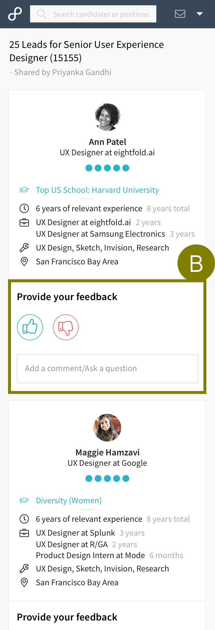
In this particular list format, the feedback section for each candidate profile gets sandwiched and lost. This would not help achieve the goal of increasing user engagement.

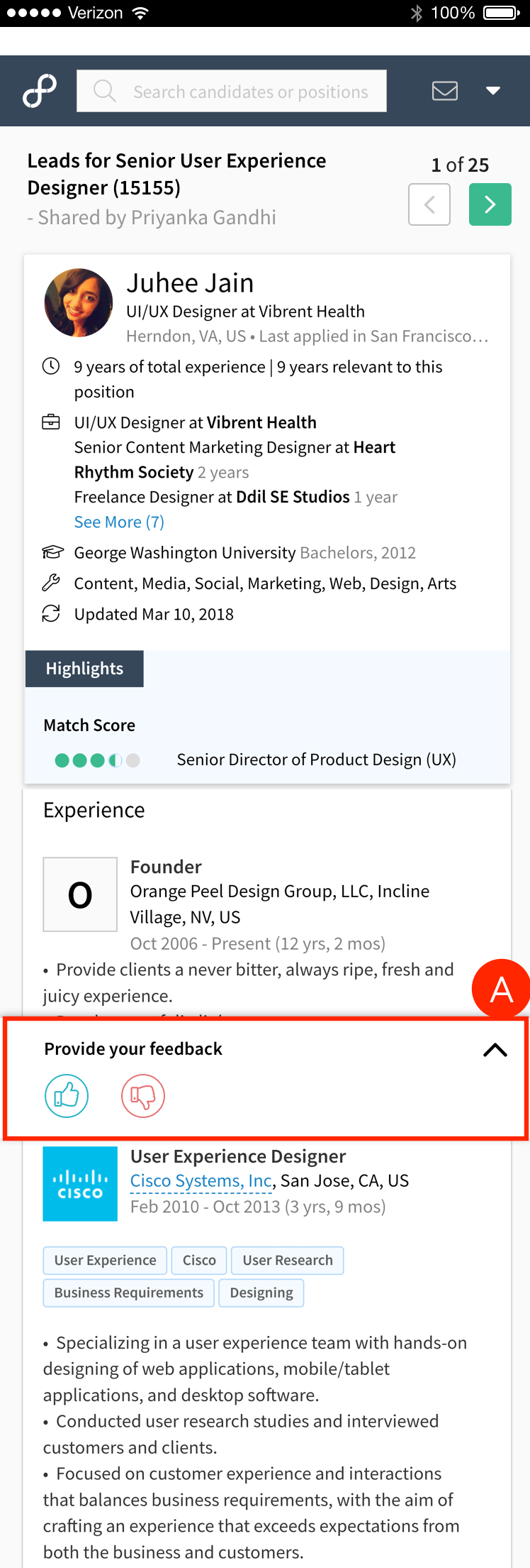
Candidate profiles are shown one at a time along with navigation controls to scroll through the list. It was observed that users found it hard to do a comparison of candidates.

In this version, it is easy to compare candidates and modify feedback as needed. We also included candidate summary of skills and experience along with a link to their full profile. This gives the manager enough and more information to make decisions about candidates.
The feedback section was pinned at the bottom for quick access. While this was cleaner and better in terms of usability, it wasn't consistent with the design chosen for the Web.

The feedback section would be shown at the end of each candidate profile card listed one below the other. Full profile can be viewed on a new screen.


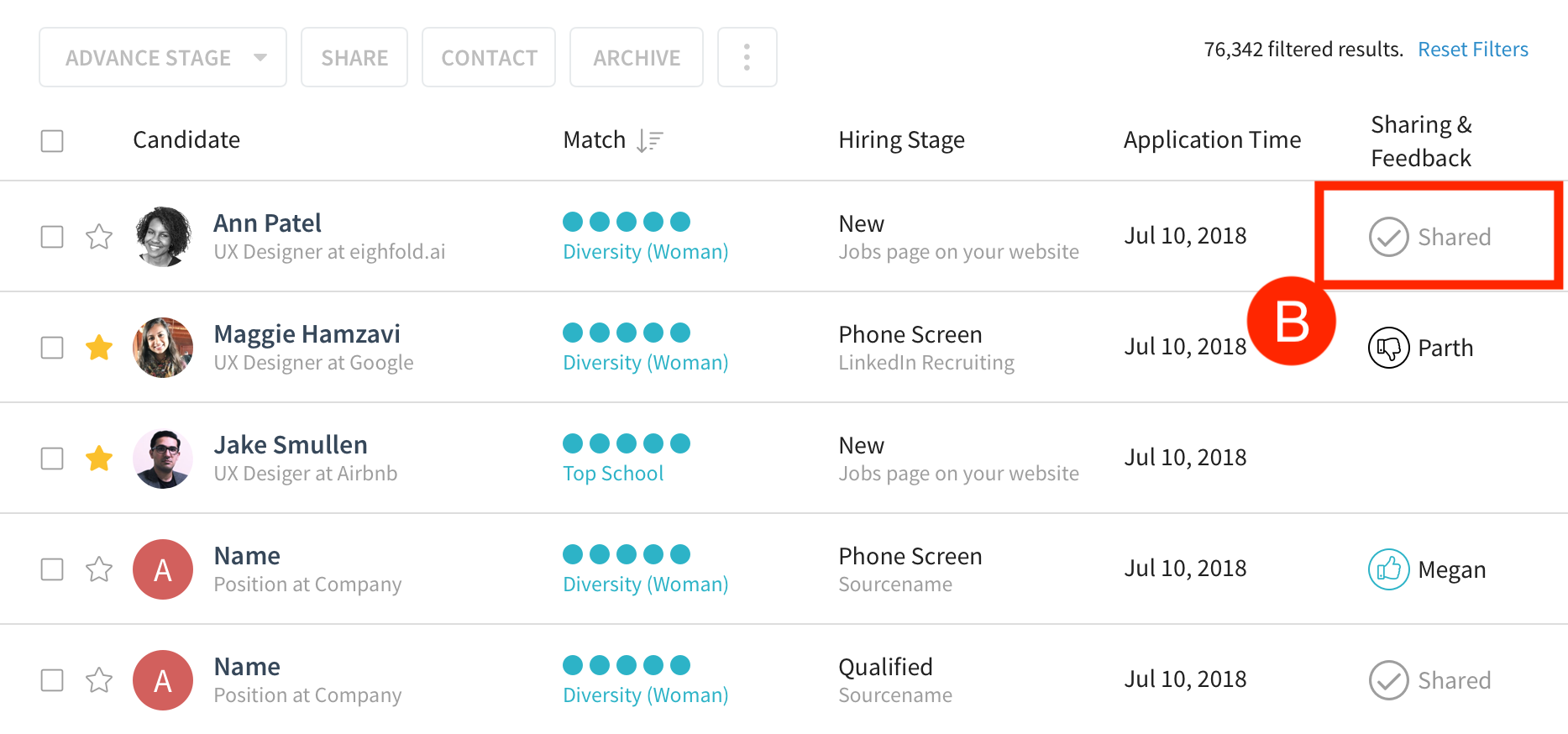
This version only had a shared icon against each candidate profile that was shared. However, this added unnecessary clutter and didn't show conclusive information.

We needed a concise way to show the sharing activity and corresponding feedback. Just showing a check mark and "Shared" still didn't specify who the recipients were.

Adding a new column was initially met with reluctance from stakeholders owing to limited real estate. However, the sharing feature was significant enough to warrant this change. Added a new column with recipient information along with feedback/comment indicators.
In order to ensure clarity during the engineering phase, I worked on a document with clear representations and specifications of all the sharing and feedback states.

Earlier, the platform had zero visibility of the sharing activity. Now, as soon as feedback is provided for a candidate, the recruiter gets notified and can view it directly on the platform. Recruiter can also clearly see which candidate profiles have been shared.
Sometimes, it appears like users need a ton of information to make key decisions. This isn't a necessity at all. More often than not, less is more.
When there are several ideas on the table, it doesn't help to hypothesise and go back and forth. Conduct A/B tests and use concrete user feedback to make design decisions.
While it's not possible to foresee all potential issues, designing for both the 80% and 20% use cases right from the get-go helps avoid a lot of them.
"We love it!", "This is solid work."
The engineering brought this new feature to life and customers couldn't stop raving about it. Some of them even said this is a game-changer. We are waiting to get more adoption stats and further feedback.
Designed a feature that uses AI to bring forth company insights such as recruiting activity, recent job applicants and prominent employee skills/credentials. I also got the opportunity to don the Product Manager hat and worked with engineers to better understand the data and determine the scope of the project.

Eightfold AI offers a personalized careers site experience which matches candidates to the right jobs. This dashboard represents its general health and the hiring funnel of visitors and job applicants. It also shows candidates who get added to the company's talent pool through voluntary sign-ups or applications for some positions but are actually better-suited for others.

Often times, integrating companies' Application Tracking System into the Eightfold platform leads to duplicate open positions. This causes redundancy and confuses recruiters. I created an intuitive modal interface to allow users to merge positions and thus, eliminate unnecessary data.

Definitely not "all work and no play". And clearly, food has been of paramount importance!
