
A concept for an Android app to keep track of the expiry dates of household perishable items.
View Prototype
7 weeks
User Research, User Experience Design, Motion Design
Paper, pen, Sketch, Adobe Illustrator, Adobe Photoshop, Flinto, Invision, Usability Hub, UserTesting
User surveys, Competitive Analysis, User Personas, Storyboard, User Story Map, User Flows, Branding, Paper sketches, Wireframes, User Testing, High-fidelity Prototype
Don't you hate it when you have a hankering for your favourite yoghurt dip and you look in your fridge only to find that it's expired? And you wish you had saved a reminder for it? Yeah, that never happens, does it?
Often times, we waste perishable resources since there's no easy way to keep track of their expiry dates. Saving reminders on devices or even leaving post-it notes gets cumbersome.
Chimer aims to provide users with a seamless experience of keeping track of this information by scanning the app when making a purchase. It requires no manual effort as expiry dates get automatically stored in the user's account! Reminders are auto-set. Users can also use a location-based search to look for stores that support the service.
This concept was dear to me since it was a problem I experienced personally. However, I needed to acertain my assumption that this is a generic problem. So, I conducted a survey on some friends and Reddit users.
Some of the crucial questions I needed to have answered were:
What kind of perishable items do users buy most often?
How frequently did users end up throwing out foods or perishable items?
What tools or measures do they take to prevent wastage?
Do they use any existing apps or services to track expiry dates?
Some discoveries based on responses from 38 users belonging to different demographics and from countries like USA, Sweden, Canada, Ireland and Germany.

shop online for perishables

throw out expired goods a few times a month

not particular about using up goods before expiry

may want to use app to automatically track perishables
Most users didn't have an easy way of tracking perishables and thus, preventing wastage. Also, they are not sure about using an app for this owing to disappointing prior experiences.
For the price of a coffee, I interviewed 2 survey takers to create befitting personas of the target audience.


I chose three apps Expiry Wiz, Beep and Barcodery to conduct a competitive analysis and identify their strengths and weaknesses.

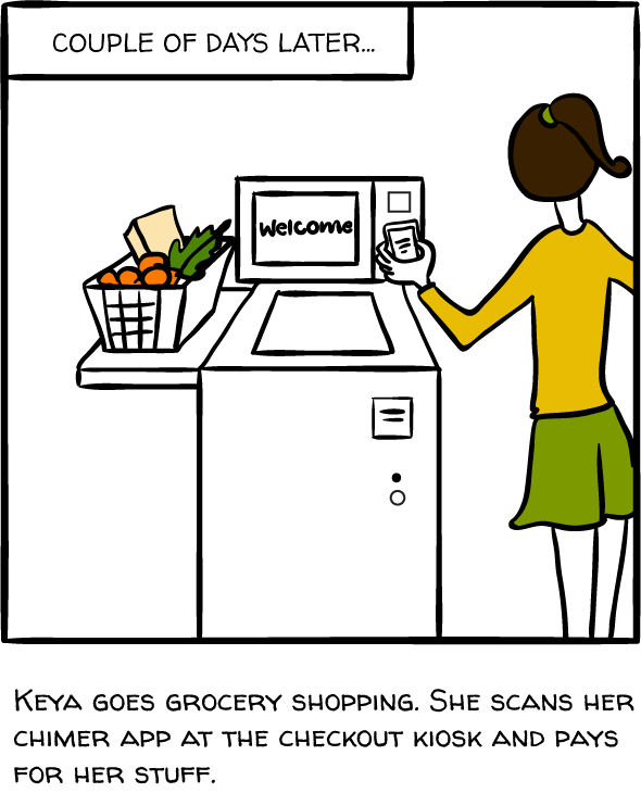
To create a more empathetic feeling around the design process, I created a storyboard that reflects how our user Keya faces the problem of resource wastage and how such an app helps her solve it.


Based on the user research I conducted, I thought of a few ideas and some of their caveats too.
User walks in and out of stores with items they require and the expiry details get auto-stored in the users' account. All the user needs to do is scan the app as they enter the store. Items are detected and tracked using weight sensors.
Caveat: Heavy investment to set up infrastructure of such a store. Unless of course, it is integrated with a service like Amazon Go.
Items have NFC tags and during payment at store kiosks, an NFC detector can be used to store data in the user's account via cloud.
Caveat: Potential failures with NFC tag detection and costs associated with adding NFC tags for every item.
Installing a device at store kiosks to scan a QR code generated in an app. As the items' barcodes are scanned, the data would get stored in the user's account via the cloud.
Assumption: Stores would have a database of barcodes of all items. These items would be categorised as perishables and non-perishables thus helping the scanner to distinctly identify the items.
This idea does have some caveats too. For instance, the effort and money to be spent on installing scanners. However, it seemed like the best one to go with at this point.

That's what I do sometimes, by the way, and it certainly is one way to look at it! Jokes apart, I defined a few UX goals to focus on:
Provide a seamless experience
Make the app do the heavylifting
Provide customisable options
Employ a machine-learning-based algorithm modelled around user behaviour
I used an Agile-based user story map to include all possible features for both MVP and future versions.

Using a shorthand method, I sketched out the user flows for the major interactions between the user and product.


Based on the research and feedback obtained, I whipped up some sketches and wireframes using Sketch so I could conduct some tests with real users.


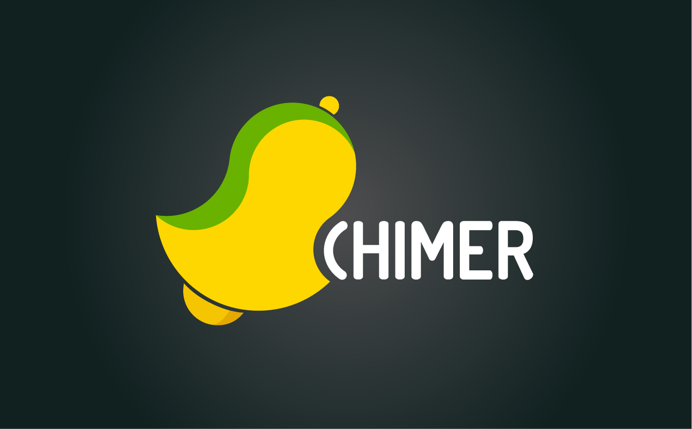
Using a word map-like strategy, I came up with representative elements for the logo. Since the app works like an alarm, I decided to name it "Chimer". The bell is tilted forwards to reflect the sense of the current fast-paced life and the highlight of green on the side is to reflect the concept of sustainability.
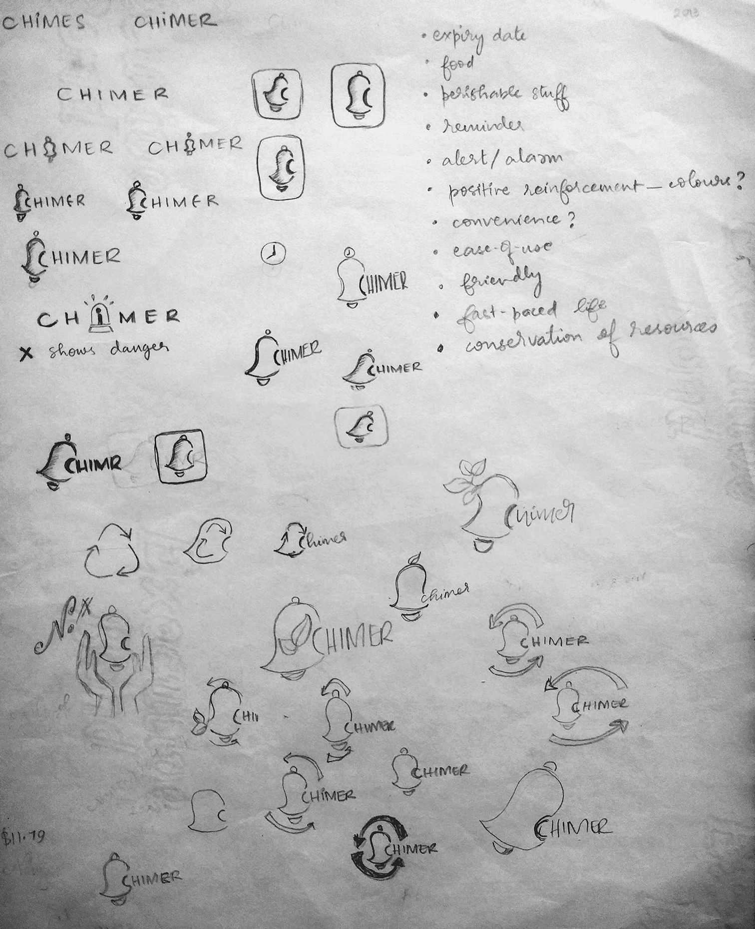
I decided to use pastel shades for a sense of calmness and, especially since the app mostly functions in the background with minimal user involvement.
To reflect the essence of resourcefulness and positivity, I chose a shade of green.
A shade of red in contrast to it for CTA elements and to make the content pop.

I conducted some Navigation and Click tests with the wireframes using UsabilityHub. Below are the heatmaps from one of the tests:


A key observation:
The task was to navigate to the list of items purchased. Users were confused by the bottom navigation menu as they assumed the menu icon had to be clicked to scan the app. However, they were still successfully able to complete the task.
As per the feedback received, I decided to vary the opacity of the navigation bar based on whether the users are first-time or returning ones. This would ensure lower abandonment of the app.
I conducted some tests to gauge the users' preference for the iconography used in the app.


80% of the users preferred the icon in design #2 over the one in design #1 because they thought it's a menu icon for the app itself.
Before the sign up step, Chimer lets you search for locations of stores that support this service. This way, you can decide whether you want to create an account or not!
Store expiry dates in your phone seamlessly, effortlessly. Simply scan the app at a store and automatically store all the relevant information in your phone.
Don't fret about setting reminders anymore. Chimes, as we call it, get auto-set for you. Needless to say, you can customise them based on your requirements too!
Look and view product information easily by filtering based on product categories, names or expiry date
Pre-defined chime duration is set for each category of products. You can customise it to suit your needs and requirements.
I used UserTesting to conduct a couple of more tests with the refined version of the prototype. The feedback was mostly positive and users were able to understand the purpose and flow of the app.
This project turned out to be an intense labour of love and it covered many aspects of the UX cycle. Learning how to effectively conduct research, usability studies and obtaining user feedback was extremely valuable. Even though users don't always know what they want, studying their behaviour helps in crafting meaningful solutions for them.
I overlooked the concept of accessibility and ended up with shades of green and red as the app's brand colours. This would hamper the app's usability of users with colour blindness. Oh well! This is how you learn, isn't it?
As for product-level aspects like revenue generation, this product could be part of a service like Amazon Go. Otherwise, it can be a stand-alone subscription service that has tie-ups with services like Amazon Fresh or Instacart to replenish expiring supplies.
For future versions, it would be great to make the service available through portable devices to be used by vendors at farmers' markets or pop-up shops. Also, include a feature to suggest recipes using these perishables would be helpful.
